Project Background
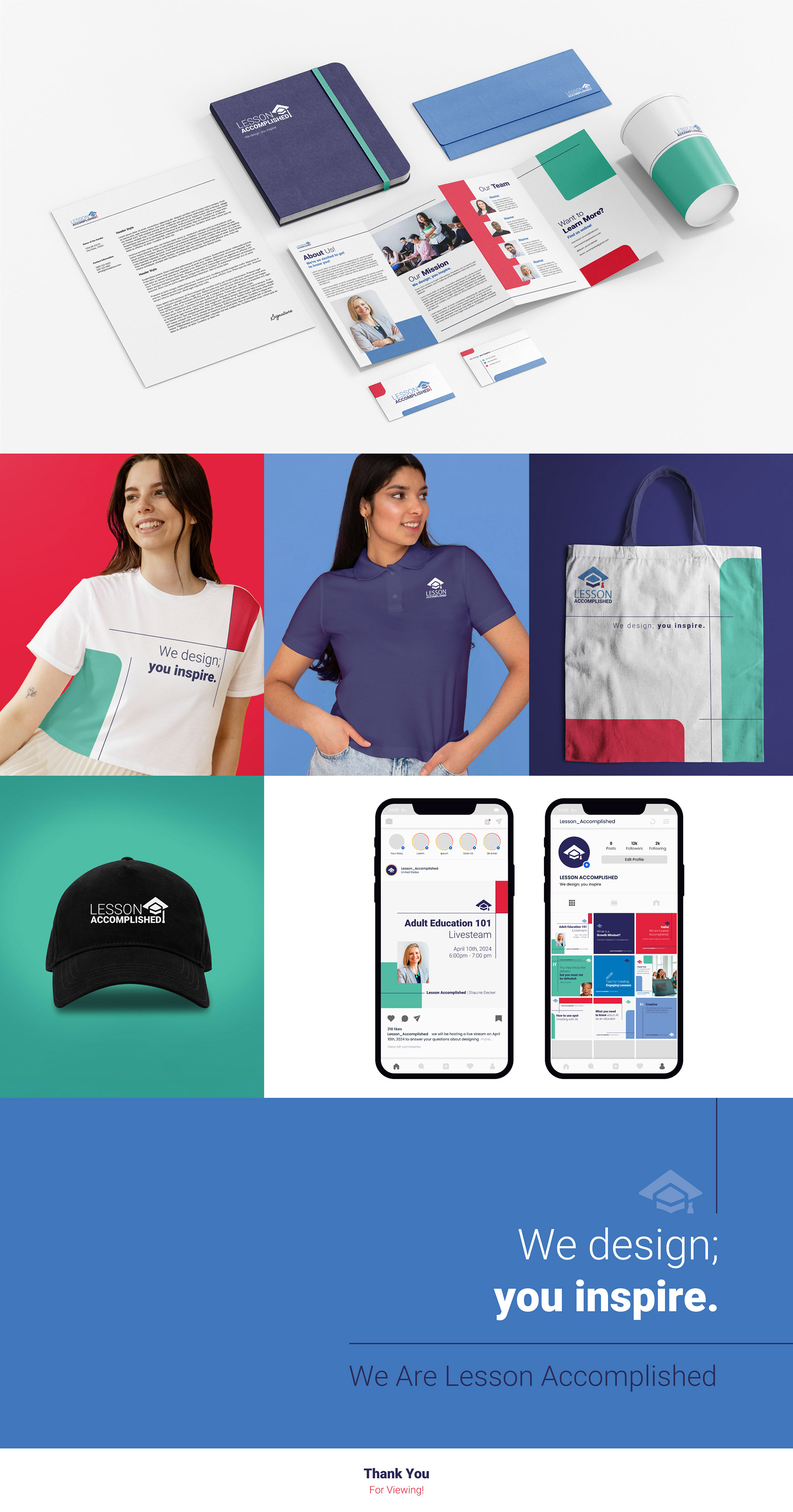
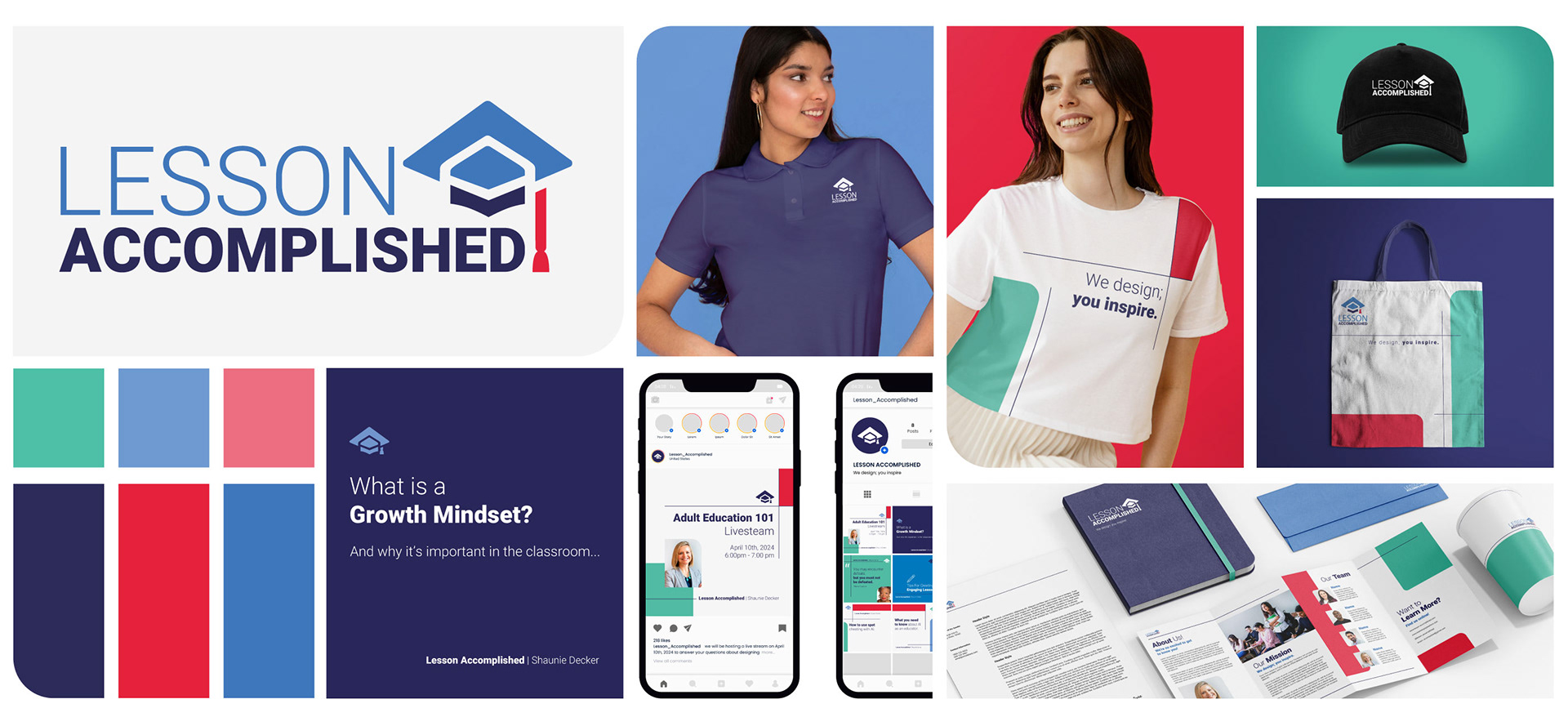
The goal of this project was to create a brand identity for a new curriculum development business called Lesson Accomplished. Lesson Accomplished is an online business that sells lesson plans directly to educators. Their primary target audience is adult educators with a secondary audience of high school educators.
BRAND BRIEF
CORE PURPOSE: To inspire learning through an inclusive curriculum.
SLOGAN: We design; you inspire.
BRAND ATTRIBUTES:
• High-Quality
• Creative
• Inclusive
• Age Appropriate
• Engaging
• High-Interest
BRAND TONE: Professional yet approachable and personable.
MAIN BRAND COLORS
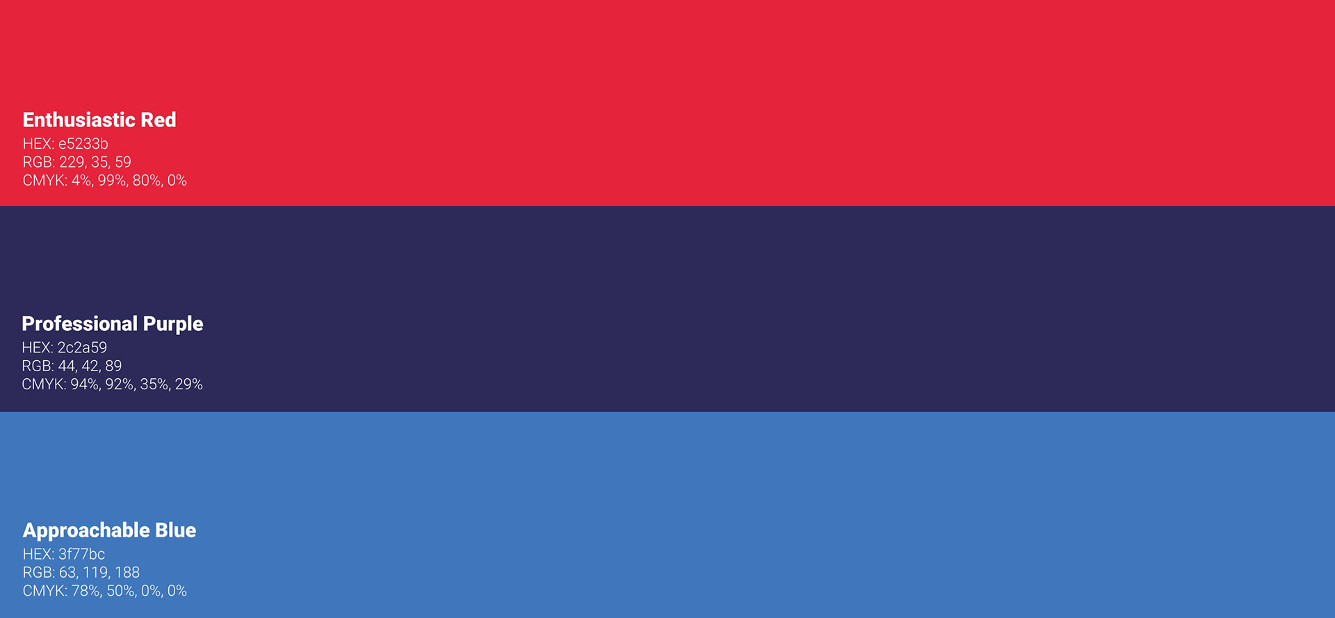
ENTHUSIASTIC RED
This bright red color was chosen to communicate the engaging and forward-thinking part of the brand. The red stands out against the mostly cool color palette. Thereby, communicating that Lesson Accomplished is not afraid to stand out with their enthusiasm for teaching, and passion for creating an inclusive forward-thinking curriculum.
PROFESSIONAL PURPLE
This bold purple-blue color was chosen to represent the professionalism of the brand. The dark blue of the color communicates feelings of stability, reliability, and calm. While the purple tint of the color keeps the dark blue from feeling stuffy and old-fashioned.
APPROACHABLE BLUE
This medium to light blue was chosen to uphold the friendly and approachable part of the brand. The blue is not too bold or bright. Allowing it to communicate a calm and inviting feeling.
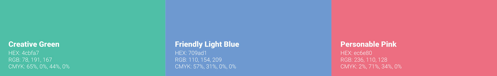
SUPPORTING BRAND COLORS
CREATIVE GREEN
This teal-like green was chosen to support the creative and lighthearted tone of the brand. The bright green feels innovative and positive while the blue-ish tint of the color keeps the green from feeling overwhelming or extreme.
FRIENDLY LIGHT BLUE
This lighter variation on the Approachable Blue was chosen to support the personable tone of the brand. By being applied in small amounts, the light blue balances out the bold Professional Purple and the Enthusiastic Red.
PERSONABLE PINK
This lighter variation on Enthusiastic Red was chosen to support the friendly tone of the brand. It can also be used as an alternate for Enthusiastic Red to help with ADA compliance.
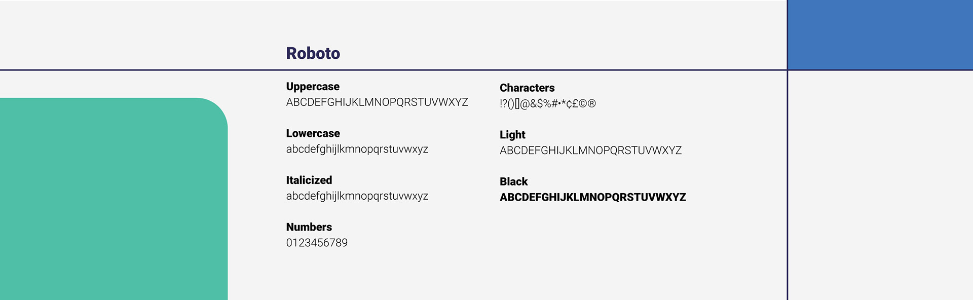
TYPOGRAPHY
ROBOTO
The chosen primary brand typeface is Roboto. Roboto is a sans-serif font designed in 2011. This makes it a relatively young font compared to other well-known fonts such as Times New Roman (created in 1932). Consequently, Roboto communicates a modern and forward-thinking tone to viewers.
Sans-serif fonts are also the best style of font when it comes to the digital display of copy. The lack of any decorative serifs simplifies the typeface which allows for less eyestrain when viewing digitally. While sans-serif fonts may often appear cold or intimidating, the roundness of Roboto’s letter forms keeps it feeling friendly and open.
Finally, Roboto has a wide variety of weights which allows the designer to balance the use of a confident bold weight with a friendly light weight.
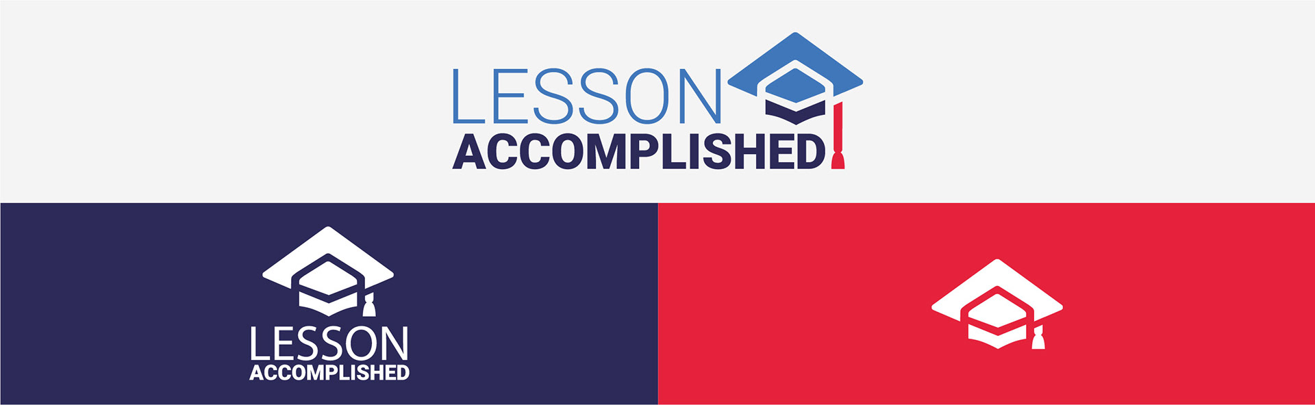
logo
The Lesson Accomplished logo was designed with student success in mind. The sans-serif bold font communicates confidence and professionalism. While the graduation cap is formed to evoke the impression of an upward-pointing arrow. Thereby, communicating the upward success that Lesson Accomplished strives to push students and educators towards. Finally, the red graduation tassel is meant to imply the idea of an exclamation point. This excited shape and color help communicate Lesson Accomplished's belief that learning and teaching should not be viewed as stuffy. Instead, Lesson Accomplished's educators find excitement in the power of thoughtful teaching innovations that propel students and teachers toward their goals.
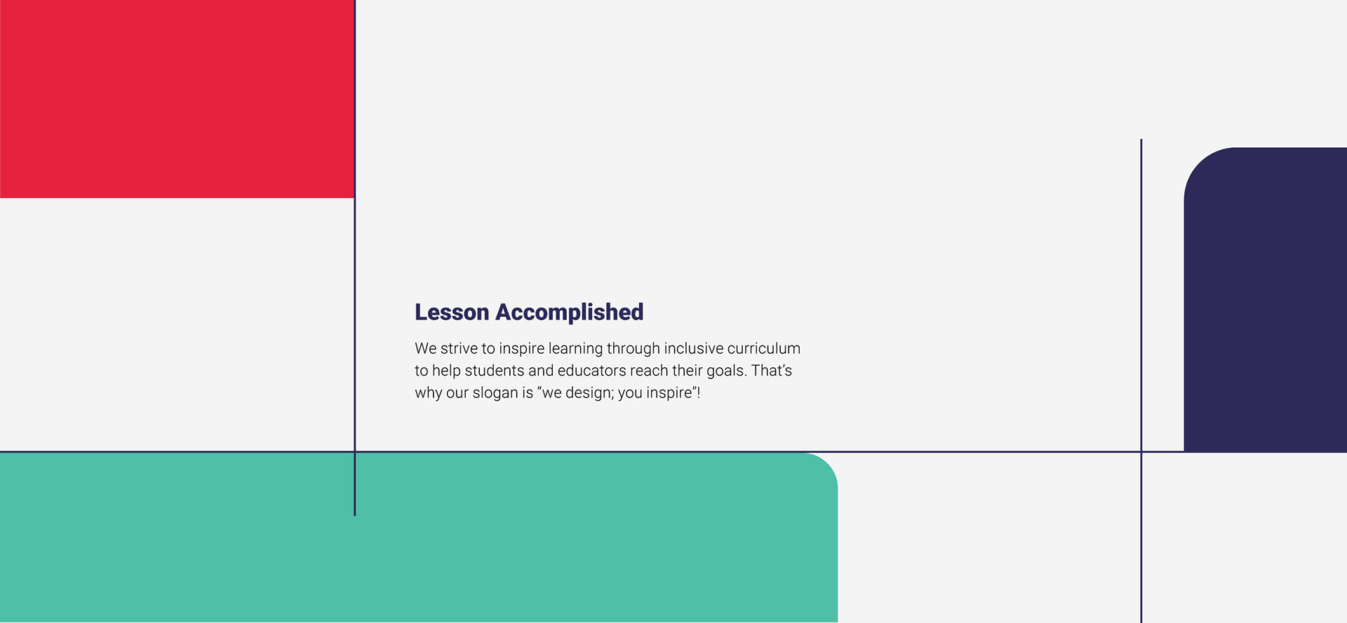
DECORATIVE ELEMENTS
GUIDING LINES
Thin lines are an important part of Lesson Accomplished's visual branding. They resemble the lines used to make guides or simple grids, without fully forming tables. This allows them to communicate the professional and dependable aspects of the brand. They also represent the innovative goals of the brand through the depiction of different crossing lines which can represent the bringing together of various ideas.
When designing, these lines can be used to add structure. For example, underlining a title to bring attention to it. They can also be used to add visual interest. In this case, the use of these lines should be kept to a minimum on products with large amounts of copy. However, they can be used more freely on cover pages, or any social media marketing designs that need to feel more visually interesting to capture attention.
The thin lines should only be horizontal or vertical, never diagonal. That is because vertical lines communicate speed, excitement, and instability. They should not always cut across the entire page. But instead, stop part way through (some of the time) to maintain an airy feeling.
BOLD COLOR BLOCKS
Another key visual aspect of the brand is bold blocks of color. These bold blocks of color communicate and modern and confident feeling to viewers. They also keep the brand from feeling stuffy or boring. The blocks of colors can be used on break pages to indicate a new section, page number, to call attention to important information, on social media posts, or to add visual interest. If the color block does not fill the whole canvas, then it should have 1-2 rounded edges that keep the shape feeling friendly. The thin lines and bold color blocks can and should be used together whenever possible to create pleasing visual contrast.