Project Background
The Problem
The Problem
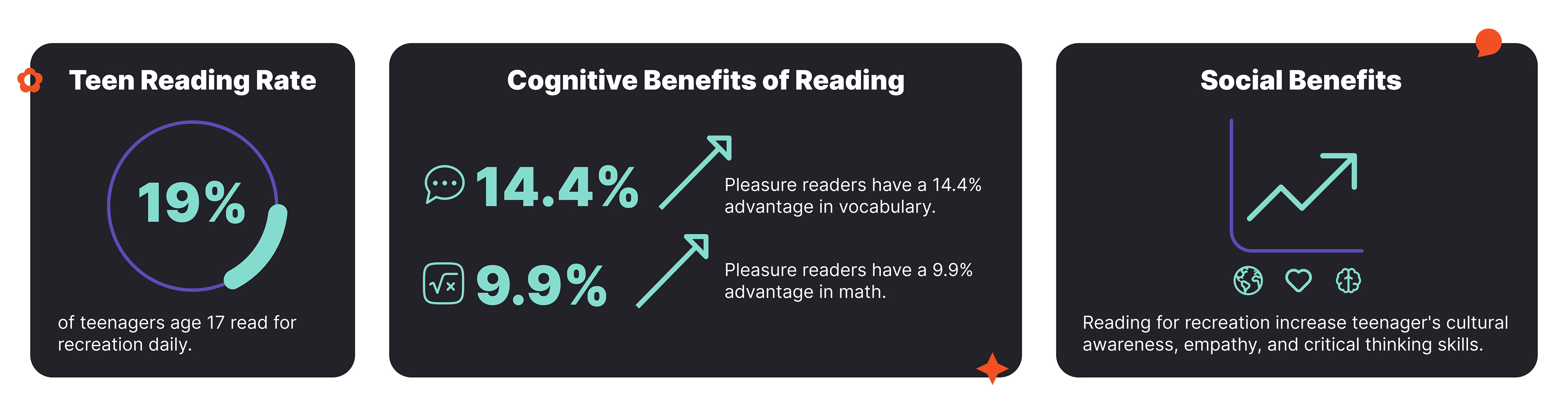
This project started with a problem. A large number of teenagers don't read for recreation. According to The Impact of Pleasure Reading on Academic Success by Christy Whitten, Sandra Labby, and Sam L. Sullivan, only 19% of 17-year-olds read for fun daily. They also found that, when looking at how many times teenagers read for pleasure in a year, 45% of 17-year-olds read no more than 1-2 times per year.
This is concerning as reading for recreation has been found to provide many cognitive benefits in teenagers and adults. For example, pleasure readers have a 14.4% advantage in vocabulary and a 9.9% advantage in math (Whitten, Labby, Sulivan). Reading has also been shown to reduce the risk of memory impairments or Alzheimer's by 40% (Reading and Health Benefits by Lambrini Kourkouta, Aikaterini Frantzana, and Vasiliki Frantzana).
Additionally, reading for recreation can increase teenager's cultural awareness, empathy, and critical thinking skills. These particular benefits are further increased when the books being consumed by teenagers are classic novels.
The Goal
As a response to the identified problem, the goal of this project was to design an interactive reading app that encouraged teenagers to consume classic novels.
The Research
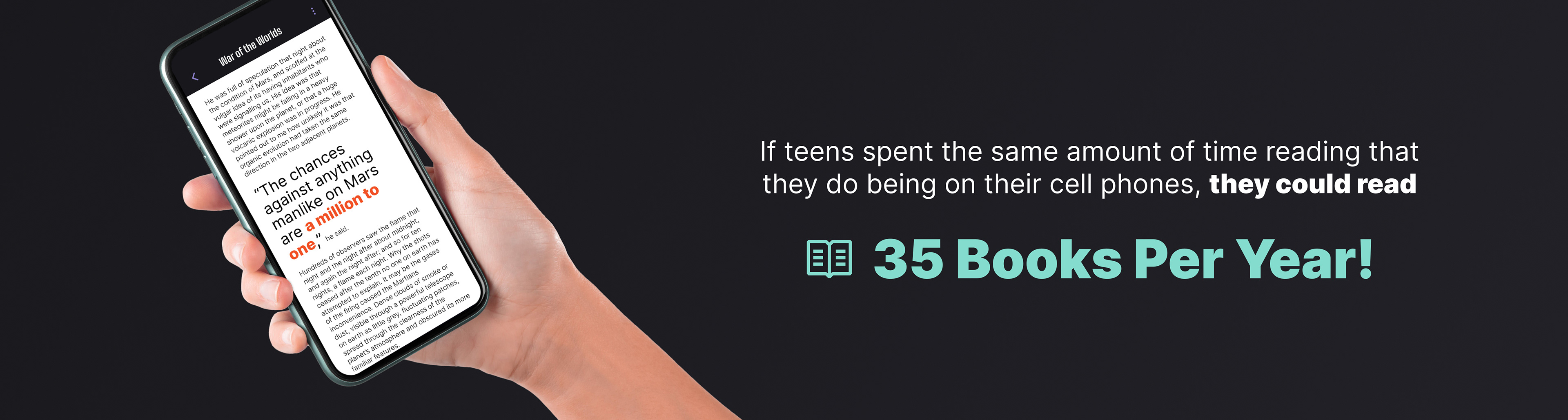
An app felt like an appropriate response to the problem because, on average, teenagers spend over 7 hours a day on their phones (Common Sense Media). This means that if those screen hours could be spent in a reading app, teens have the potential to read 35 books a year.
In order for teenagers to get the cognitive benefits of reading, they actually have to consume literature through copy. This meant that trying to engage teens through audio books or video versions of classic novels alone would not be a beneficial solution. This then led to a three-pronged approach to encouraging teenagers to read classic novels: social interactions, motivating analytics, and engaging stories. These three approaches determined what features were included in the final version of the app.

Designing the UX
User Personas
User Personas
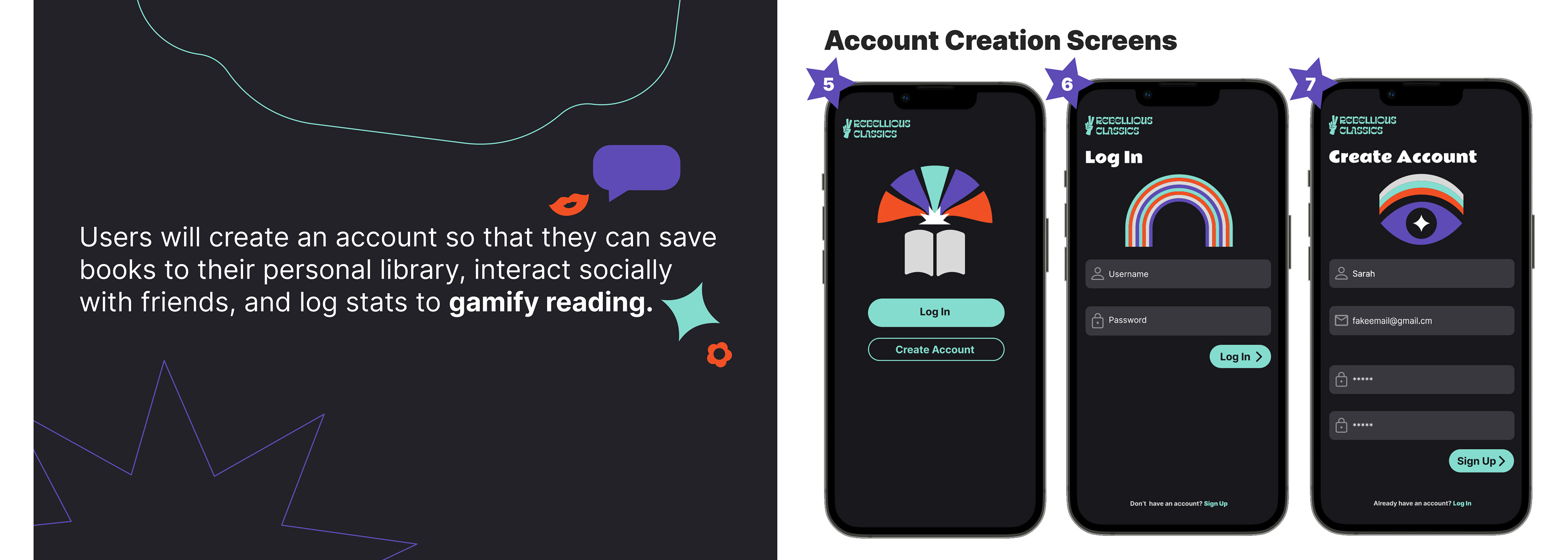
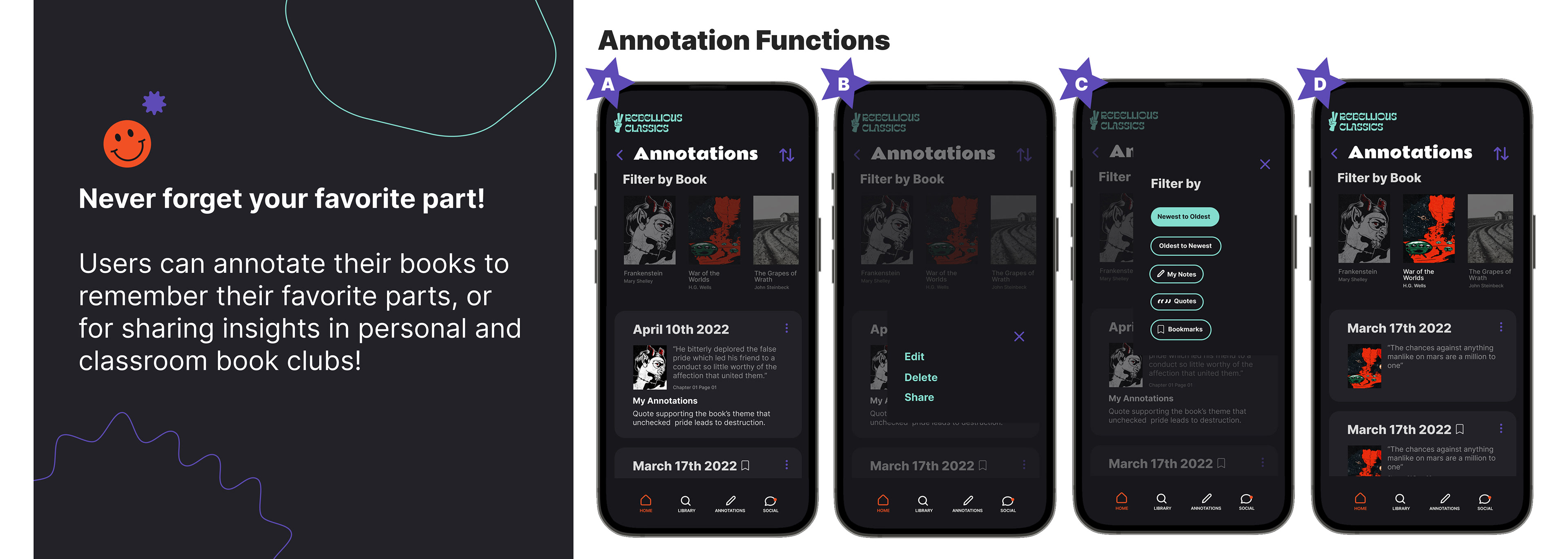
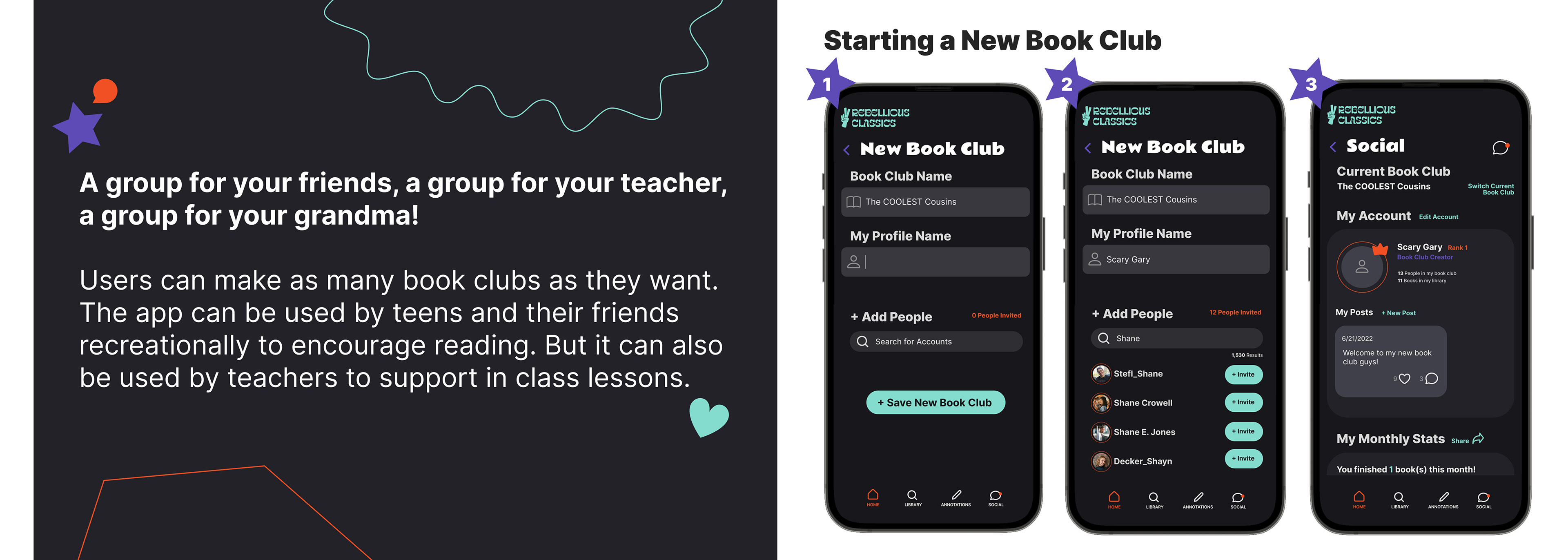
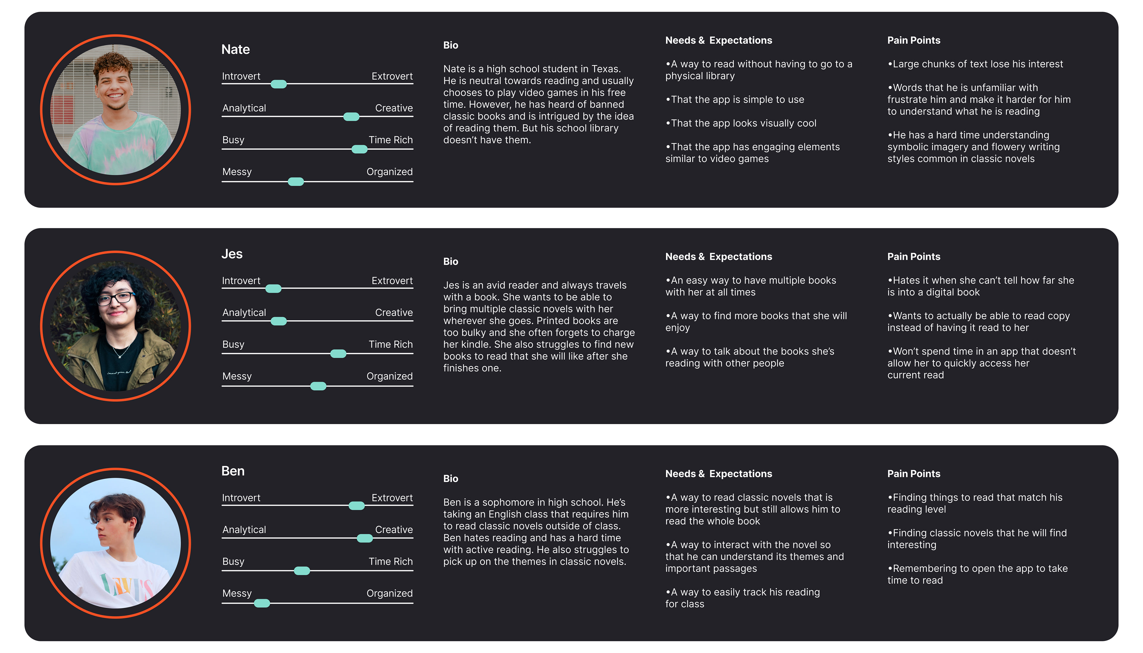
After researching to understand the problem, user personas were created to understand the teenagers who would use the app. Three personas were created to try and cover the variety of users who may benefit from a classic novel reading app. This led to the understanding that the app needed to feature dictionary, annotating, and time-tracking tools along with incentives to read.
Wireframes
The wireframing process started with simple app flows and screen sketches that were then turned into digital wireframes for user testing.

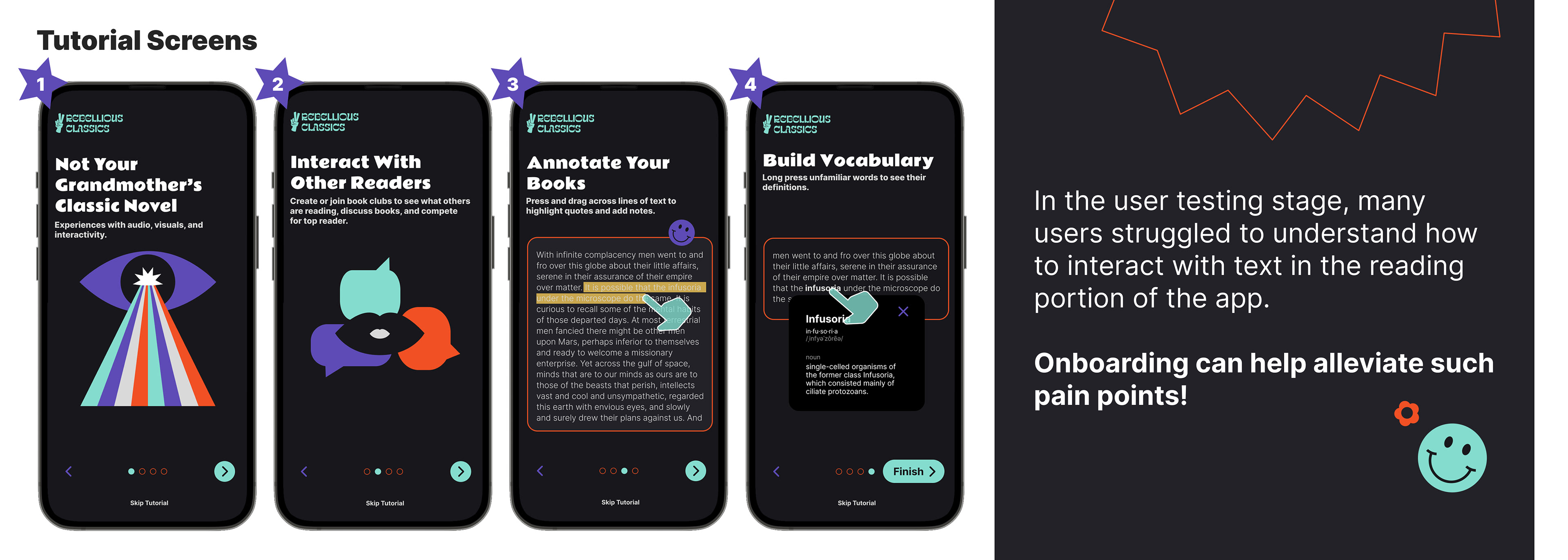
User Testing
The wireframes were then used to conduct user testing. It was most important to make sure that the reading features were clear to users to fulfill the main purpose of the app.
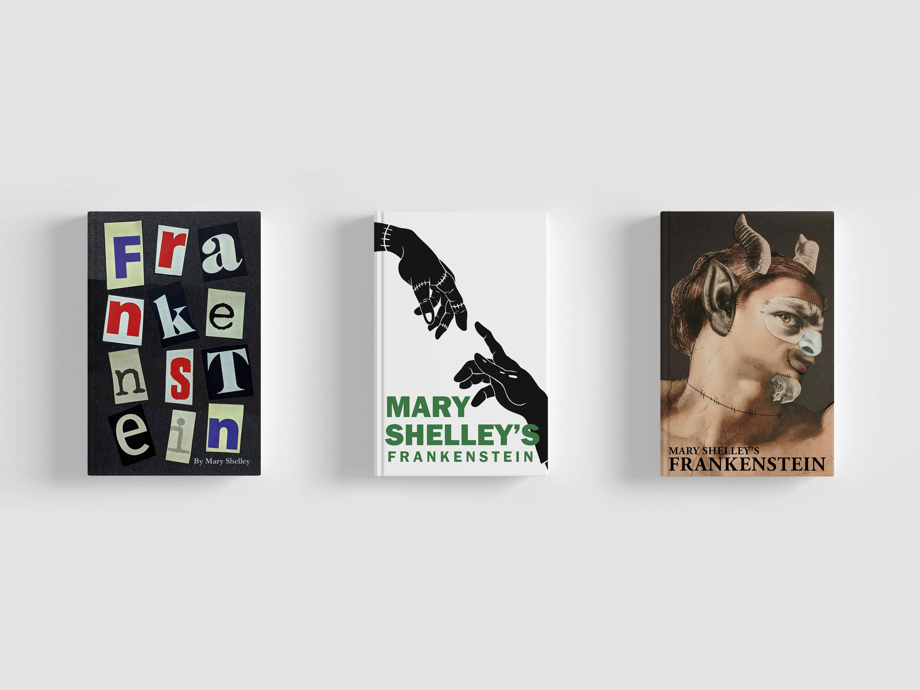
User Testing Background
You are a high school student taking your required English class. In class, you are about to begin reading Frankenstein by Mary Shelley. You have a hard time focusing on reading books. So you have decided to download Rebellious Classics to see if it will help you stay engaged in the book.
Scenario One:
You've already added Frankenstein to your app library. Use the Rebellious Classics reading app to read the first few paragraphs of chapter one of Frankenstein.
Scenario Two:
You are reading the first chapter of Frankenstein and come across the word "indefatigable". You are unfamiliar with the word and want to know what it means. Use the app to find the definition of the word.
Scenario Three:
Your class is done reading Frankenstein and plan on reading Dracula next. Find and add Dracula to your personal library.
Results
The most common issues found after user testing were the click and hold to read definition feature and not understanding how to navigate through the interactive story. The definition issue was fixed by changing it so that the user can double-click the word to see the definition and then close it with a button. The interactive navigation issue was fixed by including an onboarding process and icons that would indicate how to move forward after a set idle time.

Designing the UI
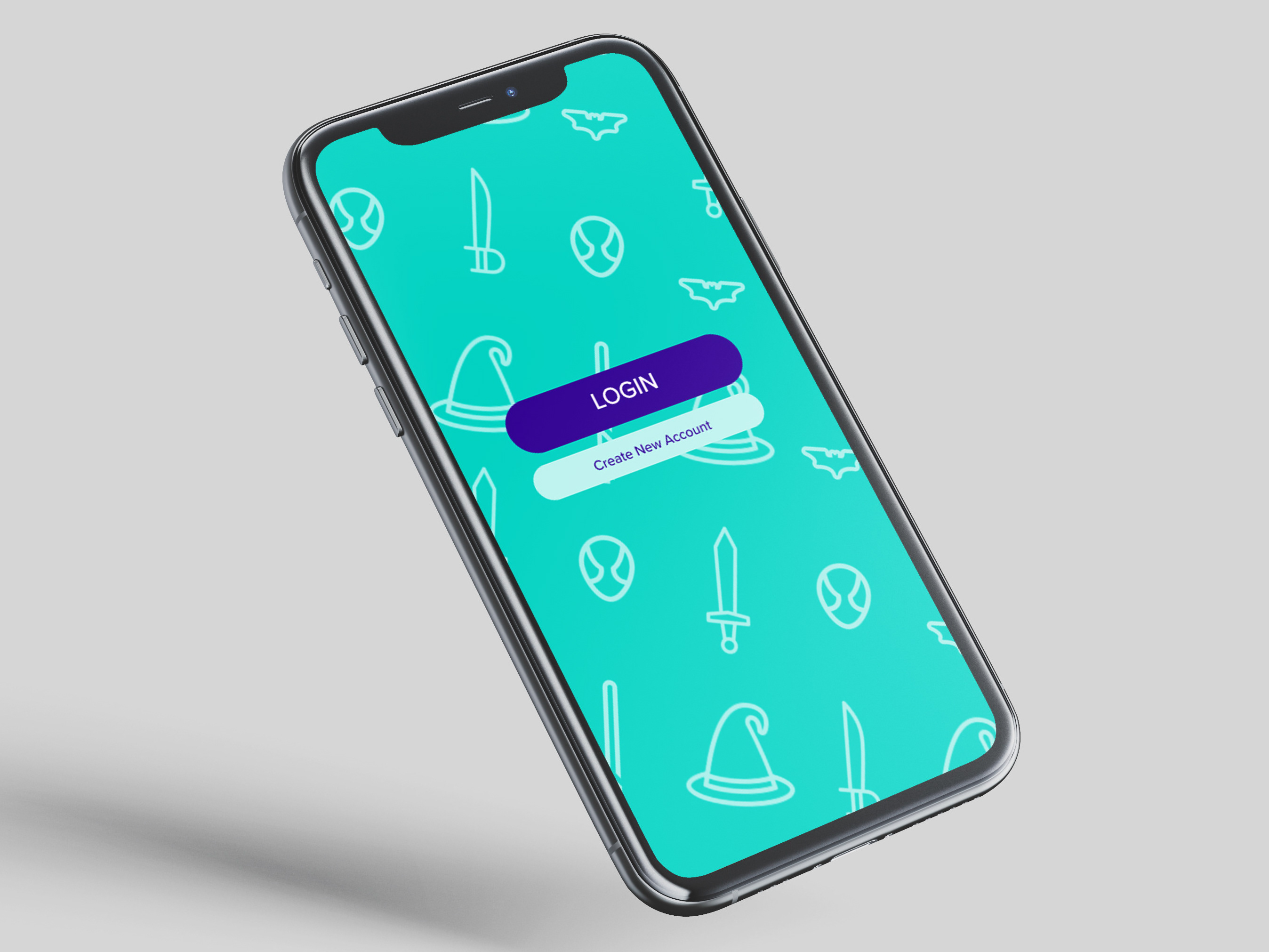
Branding
Branding
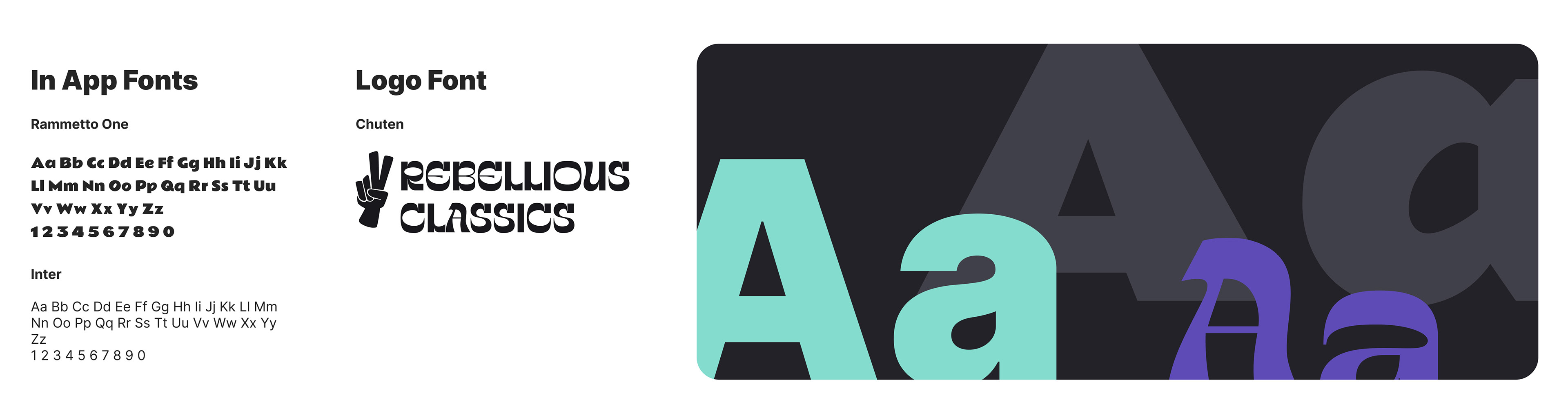
The branding was designed with teens in mind. The dark colors (black, gray, and purple) are meant to feel cool, sleek, and modern. They are then contrasted with vibrant teal and orange to bring youth and excitement back into the visual language. Most of the UI is centered on the dark black and gray colors. So to prevent harsh eye strain, true black was avoided.
Another important part of the UI branding is the funky icons and thin-lined shapes. The shapes and icons were inspired by 70s trends. However, they avoid feeling outdated by being recolored to a modern palette. These retro elements in modern colors were chosen to convey the intent of the app; bringing old books to a modern youthful audience.
Finally, funky fonts were chosen for the app's logo and title type. These fonts are bold and reminiscent of the 70s or graffiti to really communicate that cool and rebellious feeling.
Finally, funky fonts were chosen for the app's logo and title type. These fonts are bold and reminiscent of the 70s or graffiti to really communicate that cool and rebellious feeling.

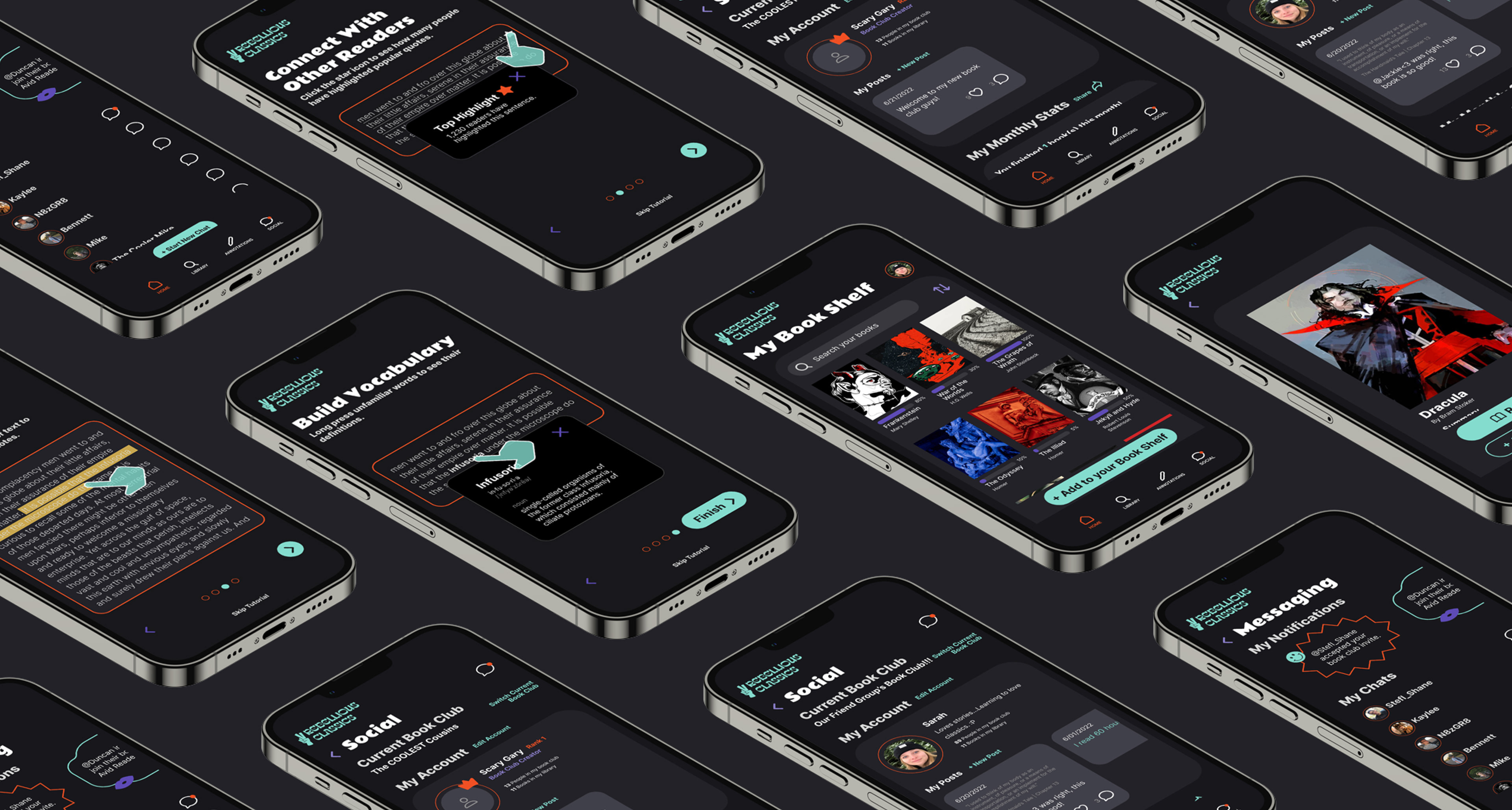
The Final Product
Library, Annotations, and Social
Library, Annotations, and Social