Original App
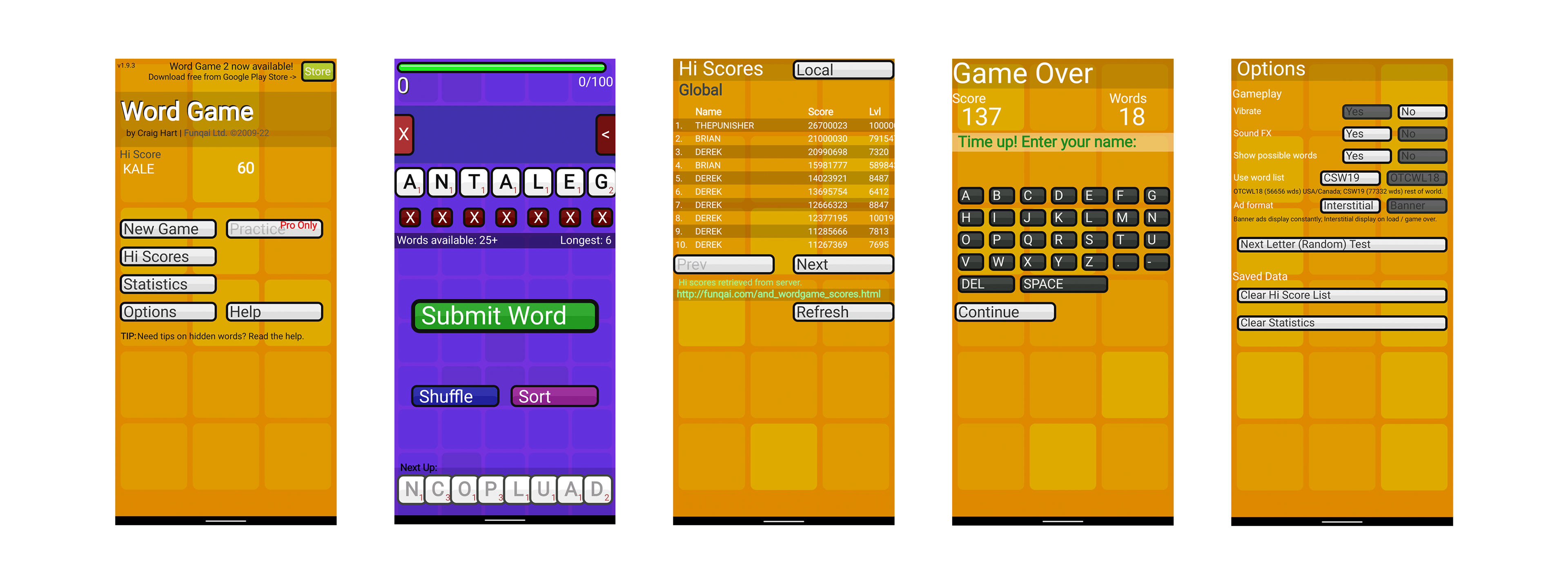
Home screen, Game play screen, Game over screen, Leaderboard screen, Settings screen
Project Concept
I redesigned five screens for a simple spelling game in the Google Play app store. The app is called Word Game and was created by Craig Hart.
Problems with the original I wanted to solve
-The original home screen has a poor hierarchy.
- The home screen buttons feel outdated.
-The gameplay is cluttered.
-The point system is unclear.
-The time-down timer is unclear.
-There is poor contrast on the gameplay screen in a few places.
-The game over screen looks like a calculator.
-The high score screen has a poor hierarchy.
-The options screen is cluttered and not aligned.
New Branding | Color Selection
I wanted the app's new UI design to communicate more about the game. The game is based on spelling so I wanted to highlight the learning and knowledge aspect of the app. I decided to go with a mainly blue color pallet to achieve this goal. I then added orange and yellow as supporting colors to help communicate the fun and exciting aspects of the game.
New Ui Layout
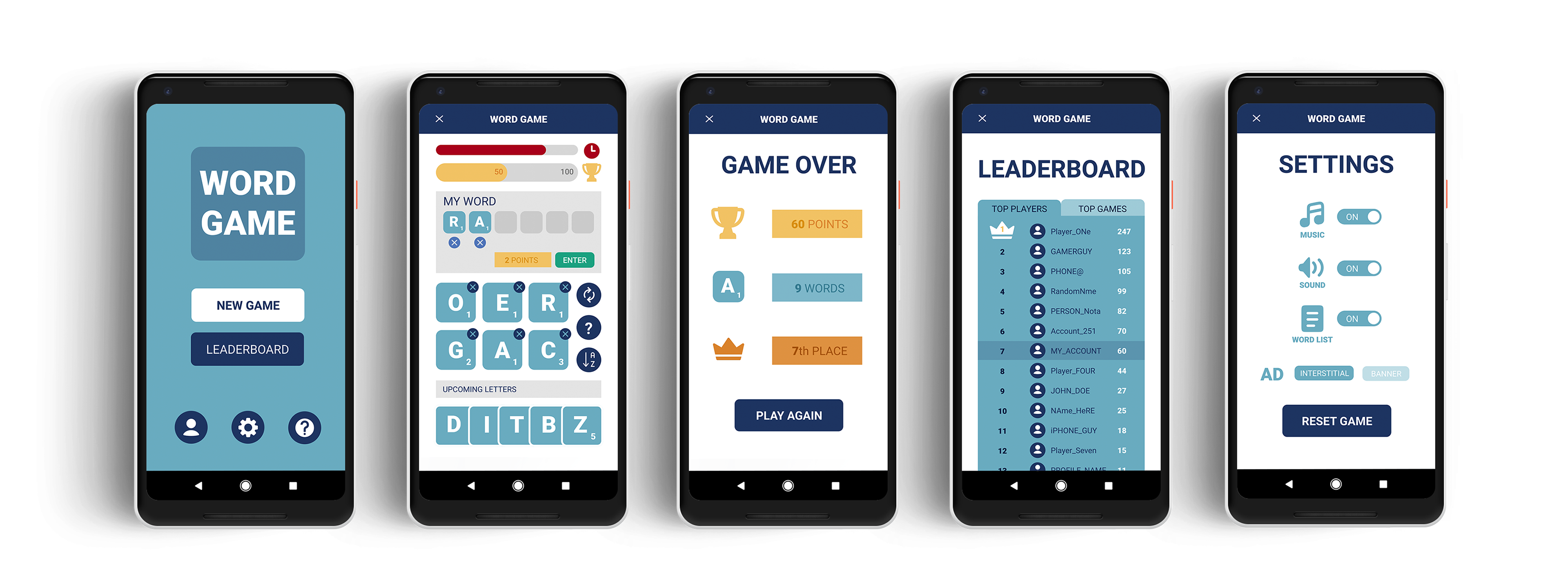
Home screen, Game play screen, Game over screen, Leaderboard screen, Settings screen